Good news, everyone! The American economy seems to be doing pretty darn good.
The American people do not appear to appreciate the fact that their economy is, quite literally, in a class by itself. In an earlier post entitled "Americans Hate their Fabulous Economy," I tried to make that clear by comparing the recent Bush years to the preceding Clinton years in terms of their economic performance. I did not seek out obscure and esoteric economic indicators that could be used to mislead people into thinking that their hopelessly anemic economy is actually in great shape. Instead, I analyzed the basic economic indicators that have been used to gauge the health of any economy for decades. Those indicators reveal that America's economy during the Clinton and Bush years can only be described as fabulous -- and almost equally so -- in both cases.
Engram links many many charts from Per captita GDP, productivity and so on, with data from places like OECD. He concludes with a thought that Ben might have asked
Oh, and one last thought: if you are a determined pessimist, I know exactly what you are thinking. You are thinking this:OK, fine. The American economy is booming. Big deal. Only the rich are benefiting. What about the average guy? And what about the poor? Everything is getting worse for them. They'd be way better off in Europe. Right?
He answered that here
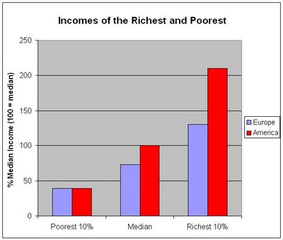
Today, I'm only going to show you one simple chart. This differs from my usual tactic, which is to badger you into submission with one informative chart after another. But today's chart is an especially important one because I believe contains what you mainly need to know in order to understand how the benefits of our relentlessly expanding economy are distributed across the population (from rich to poor). Jump to the end of this post if you trust that I did my homework and you only want to see the take-home story. But read on if you'd like to know about my difficult quest to obtain the relevant information.
All of these measures are relative to the U.S. median DPI (which is set to 100). Memorize this chart. It's what you need to know. As Tom Worstall noted, those in the lowest 10% here have about the same disposable income as those in the lowest 10% in Europe. It's almost an exact tie. At the other end of the scale, the highest 10% here have much higher disposable incomes than the highest 10% over there. Are only the rich making off like bandits? Well, look at the middle guy (i.e., look at the median). The European in the middle makes only about 73% of what the American in the middle makes.
And there you have it. That's how America's fabulous economy distributes its benefits across the economic spectrum (relative to other nations). Those at the bottom of our economic ladder are similar to those at the bottom of other industrialized nations. One would imagine that, in all of these nations, the government tries to ensure that the basic needs of the poor are satisfied (e.g., adequate food, uncrowded living conditions, plumbing, electricity, etc.) without going much further than that. But as you start moving up the economic ladder, you are better off here in America. And that would appear to be true starting pretty far down on that ladder (somewhere below the median for sure).
There is more to say (and I will say it!), but for now, here is the take-home story: In America, you start at the same place on the economic ladder relative to the other industrialized nations of Europe, but you get further ahead of your European counterpart as you climb.
Of course that's just the comparing the West, specifically Europe and America.
Part Two
