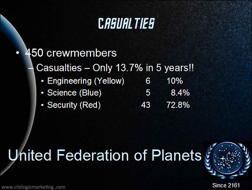
Red Shirt casualty analysis from Matt Bailey.

Only 13.7% for a ship of exploration in a rough galaxy. Not bad.
Matt points out that this is entertaining but ..
Click the link for a much better way to visualize the data.
Via.

Only 13.7% for a ship of exploration in a rough galaxy. Not bad.
Matt points out that this is entertaining but ..
There are a number of things wrong with the typical method of presenting data. For starters, this presentation could bore even the most hardened Starfleet manager (CEO). The typical corporate PowerPoint slide design is obnoxious and does not leave room for information, the charts are redundant, even unnecessary, and it does not do a good job of communicating the information or the analysis.
Click the link for a much better way to visualize the data.
Via.